
morgueFile
Photos are free to use, but crediting the photographer is expected. To use the photos for print or on merchandise, it is best to seek the photographers permission.

Photos are free to use, but crediting the photographer is expected. To use the photos for print or on merchandise, it is best to seek the photographers permission.

Photos are royalty-free for any application including commercial use. Attribution is also not required and many photos are free to use.

Photos are free to use after paying for the subscription. The Standard subscription allows for most publications except large print runs or merchandising. The Enhanced License allows for larger print runs and/or merchandising.
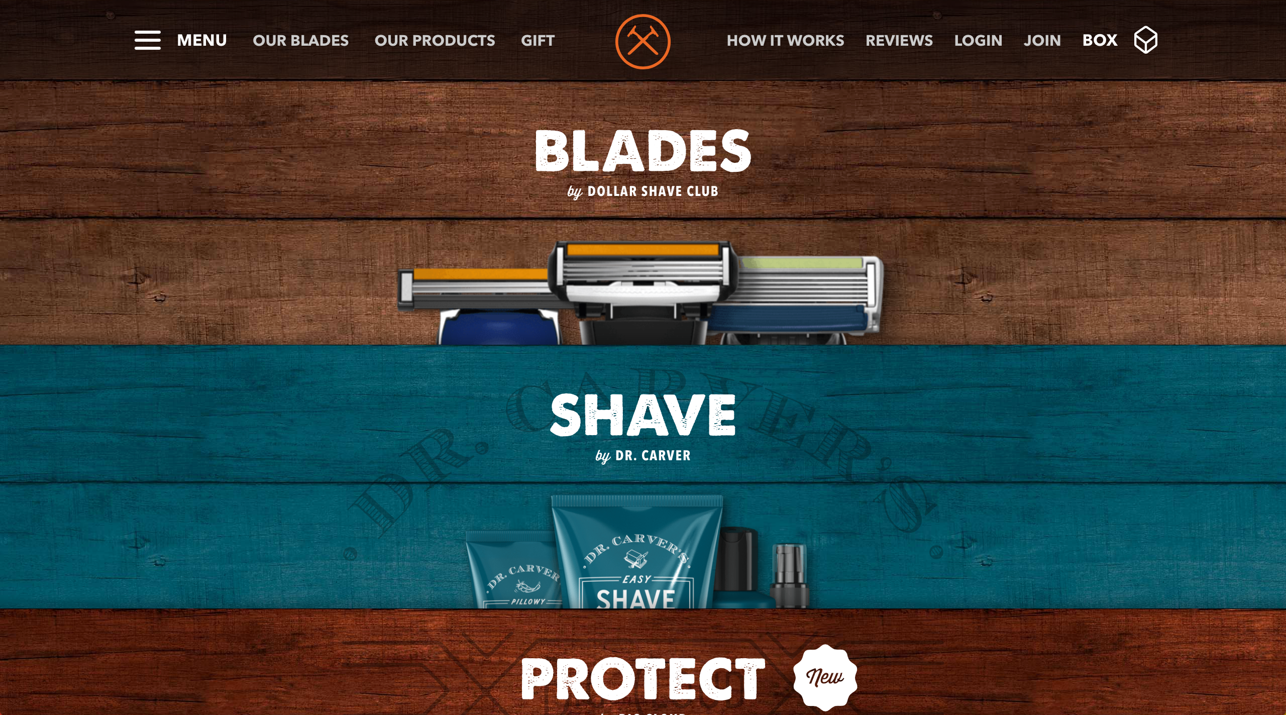
Avenir (sans-serif) and Thunder (decorative)
Thunder gives the design a letterpress feel and makes it look rugged in a way. Especially over the wood-themed background. The sharp/hard edges of the letterforms of both typefaces also reflect the qualities of a razor. Avenir helps to complement Thunder with a similar shape in the letterforms and is a highly readable typeface.
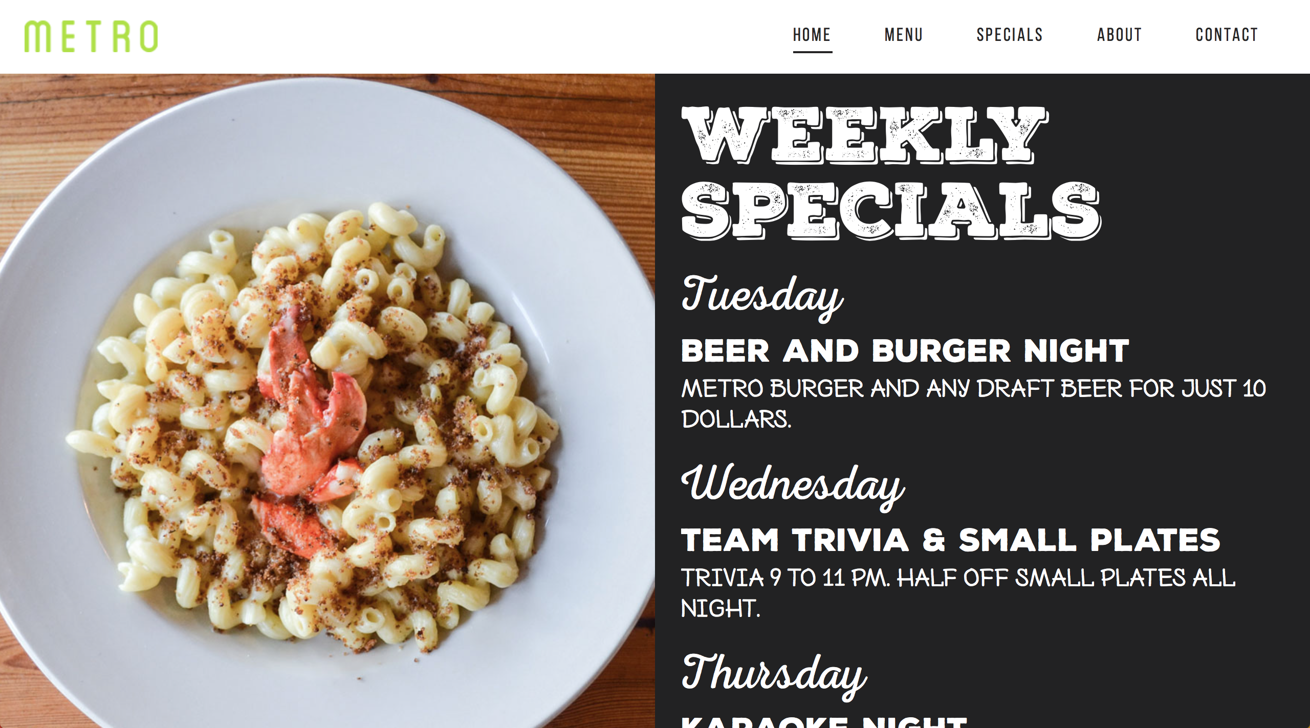
Nexa Rust (decorative, handwritten, and script) and Bebas Neue (sans-serif)
This combination of typefaces gives the site the feeling of a local restaurant. It is like your reading the menu from a chalkboard that was written or drawn that morning. The white font on a black background reinforces that notion. The typeface variance helps organize the sites hierarchy of information as well.
28
Graphic Designer at Epic Design, LLC.
B.A. in Graphic Design from Virginia Commonwealth University
Richmond, VA

Franklin likes to begin his day with a cup of coffee and a quick skim of his email inbox. He prefers to use gmail and read his email on a Macbook Pro. He has an iPad, but generally likes to use that for video consumption and games. Franklin is very interested in technology and would likes to have it touch many aspects of his life. Things like a smartphone, fitness trackers, and the smart lock he installed on his front door are all very important to him. Franklin is also quite dependant on technology for his job as a graphic designer. Anything that can be made easier by tech in order to get out of his way, helps him focus more on his craft as a creative. Franklin has an active social life as well, in social media and in his daily interactions. Because of this, he likes to be well informed about the issues of the day in order to keep pace with conversations. He considers himself to be well educated and wants to be perceived that way.
There are many design and technical considerations when creating a webpage that will be suitable for many device screens. This section of the prompt will discuss some of the ones I have found to be important. First we will look at 3 technical considerations and then 2 design considerations to improve the user experience.
Using a meta tag, it is possible to set the viewport, the visible area of the devices screen. Doing so allows a design to better adjust to a given device's width instead of trying to interpret a design from a desktop's standards. To do so, we need to use a meta tag and have it say the following:
< meta name="viewport" content="width=device-width, initial-scale=1" >
This now tells the device to interpret the HTML/CSS code to adapt to the current devices width and pixel density. It is also possible to disable user scaling (pinch-to-zoom) during this process, but that is not ideal in cases of accessibility.
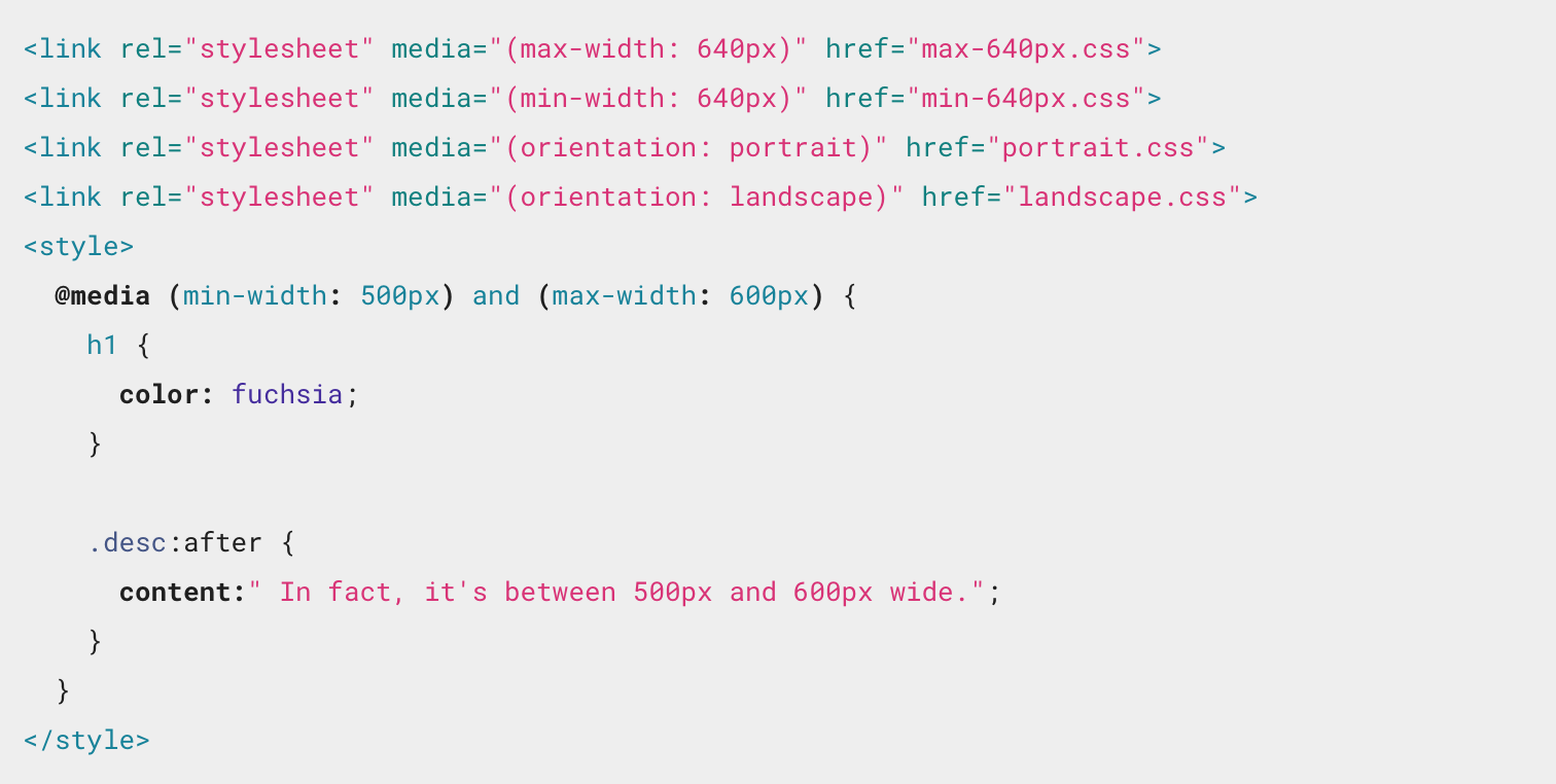
Media queries allow you to adjust the CSS of a page based upon screen size, orientation, and a host of other elements. Adjusting for screen size is one of the key elements in responsive design. Below is an example from a Google tutorial of what a media querie looks like. It's possible to have different stylesheets for each device width that you intend to design for to help keep things organized.
When sizing images in a responsive design it is best to set their width to 100% and the height to auto. An example is below. This allows for an image to be resized easily with the increase/decrease of a screen's size.
img {
width: 100%;
height: auto;
}
It is important to design areas, that are intended to be clicked, with large areas of space. This is important to allow for a finger to easily click on it. Having to zoom in or move around the page in order to access the link can be a frustrating process. User testing will help identify if clickable items need to be resized.
Reducing image file sizes helps a design in a number of ways. It helps loading times, especially on slower mobile connections. It also helps reduce the impact on a users data plan. Using image sprites is one solution to this problem, especially when many images need to be used. Keeping them in one file that only needs to be loaded once helps this process. Another consideration is to reduce images all together to help speed things up. Using the HTML canvas or CSS to create some images will make the loading process much snappier as well as the resizing of the site for mobile designs.
Here is the link to my awesome Wordpress companion site. It's gonna be amazing.
GlennJTCC.wordpress.com
Drupal is great for all types of projects. Simple to complex, Drupal can do it all. It is quite popular and has a lot of support which makes it great for simple projects, especially ones that have the potential to grow to into big ones.
• Great Community Support
• Basic Installation
• Optional add-ons like forums and profiles
• May be too complex for very basic projects
Expression Engine is designed with flexibility in mind. It allows for easy comprehension of its backend. A very good choice for clients that will need to manage their own site without getting their hands too dirty.
• Highly Extensible
• Global search and replace functionality
• Great template engine for designers
• Expensive. Support can cost as much as $2,000/month
Radiant CMS is a simple and elegant software solution. It's an open-source content system designed for small teams. The system also has plug-in and extension support as well.
• Simple user management and permissions
• Flexible templating
• Simple and elegant software
• No WYSIWYG editor
• Would need to learn Ruby
• Has its own templating language, not HTML
Joomla is quite an advanced system for content management. It sets up with ease and is highly configurable. Ebay and Barnes & Noble are both users of this CMS.
• Over 3,000 extensions available
• Multilingual support
• Media and banner management tools
• Themes and extensions are costly

Silver Stripe is a content management system that offers open source and professional services. They offer cloud hosting as well as infrastructure support. It is focused more on content management than blogging.
• Native SEO support
• Content version control
• Administration area is customizable
• Small developer community
• Minimal themes and widgets available
• Doesn't offer designers much style to work with
Alfresco is a serious and scalable content management system. This one is for power users. Some of their big name clients are Saks Fifth Avenue, NASA, and FOX. They offer consulting and training services amongst their many offerings.
• Great choice for enterprise needs
• Easy to install
• Administration is clean and well-designed
• Not beginner friendly
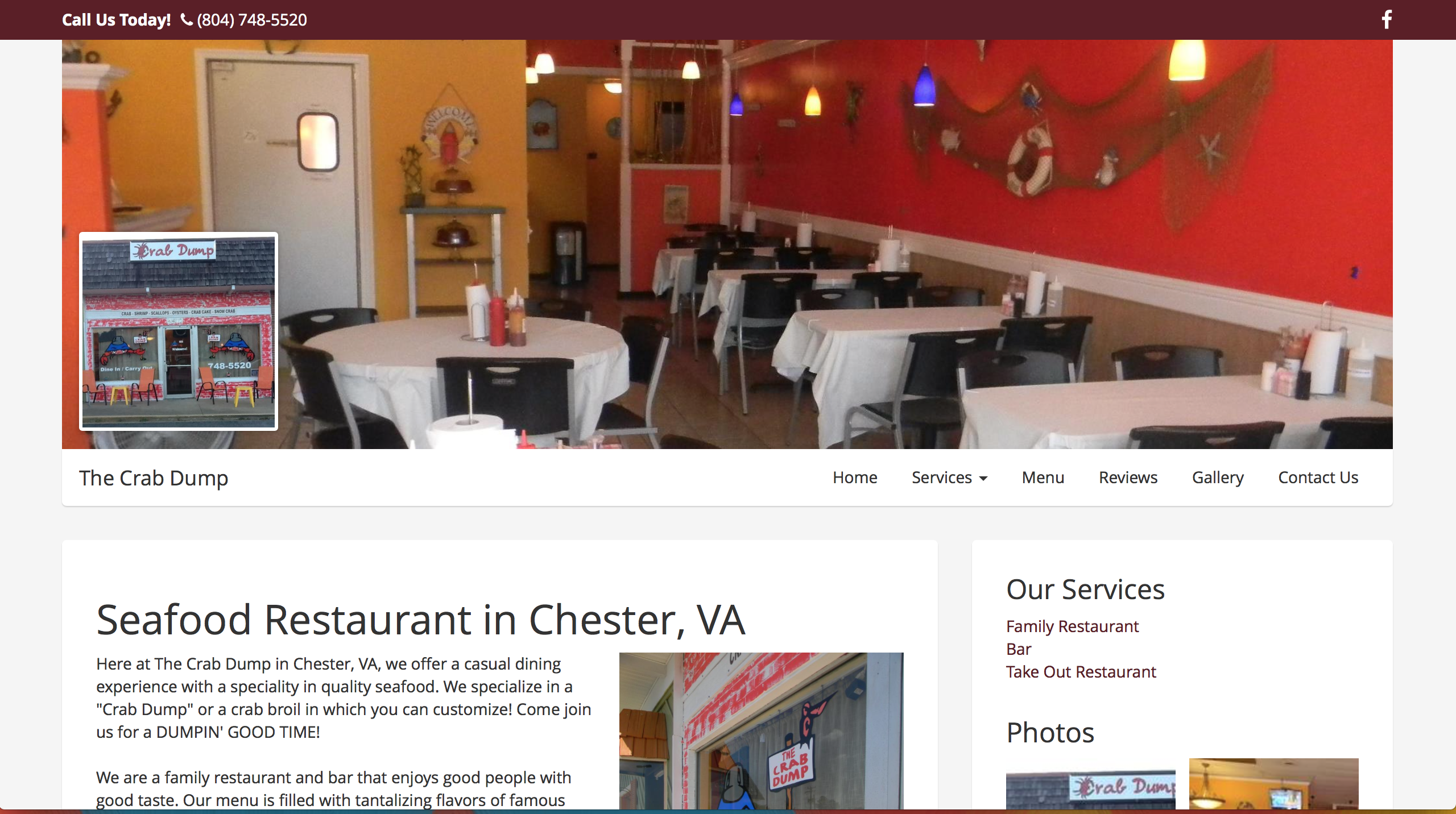
The Crab Dump website is a very basic Bootstrap site. Almost nothing has been altered from the original stylesheets. The site is also responsive, which is always a good reason to use Bootstrap. The site has pretty much the exact same structure from page to page with only the columns in the body changing content. It is minimal and communicate the basic message of the business.
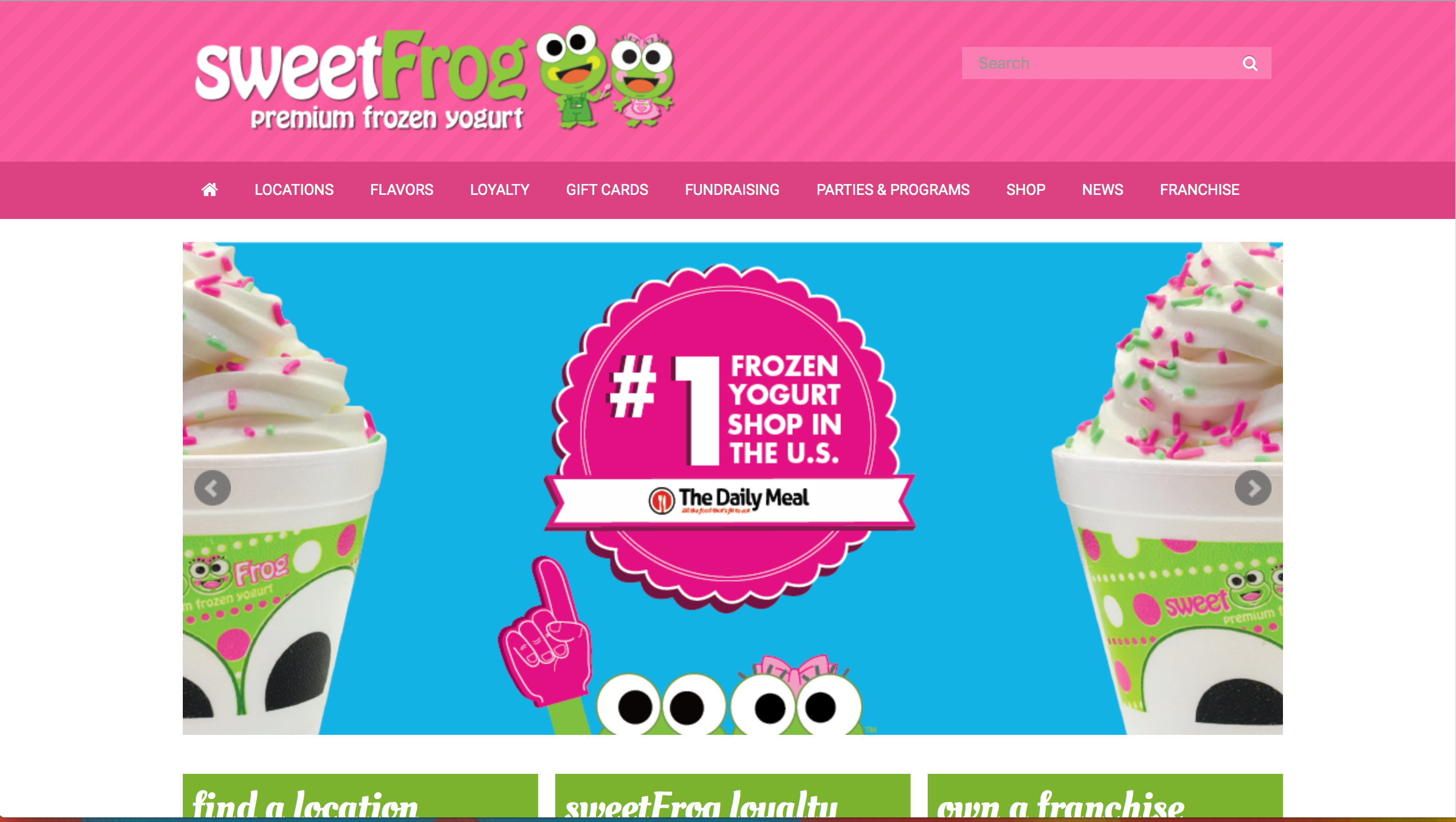
I have watched the Sweet Frog site progress over the last year or so from an "in-progress" site to the current one. It is based off of Bootstrap. Colors and typography depart from traditional Bootstrap sites and reflect the branding of the company. The site still preseves a standard Bootstrap layout with rigid columns, but shows a more flexible layout than the one in the Crab Dump site. The creators of the site have also added "smooth scrolling." It is also a highly responsive site as well just as one would expect from Bootstrap. The overall site consists of many pages and has a consistent look and feel throughout the site as well.
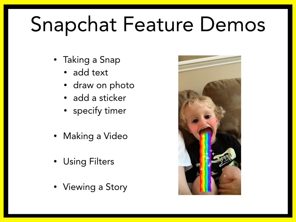
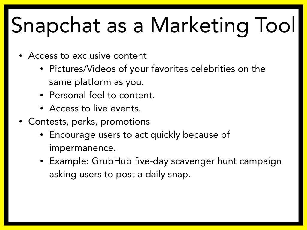
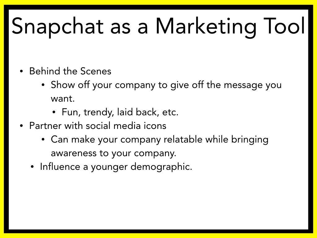
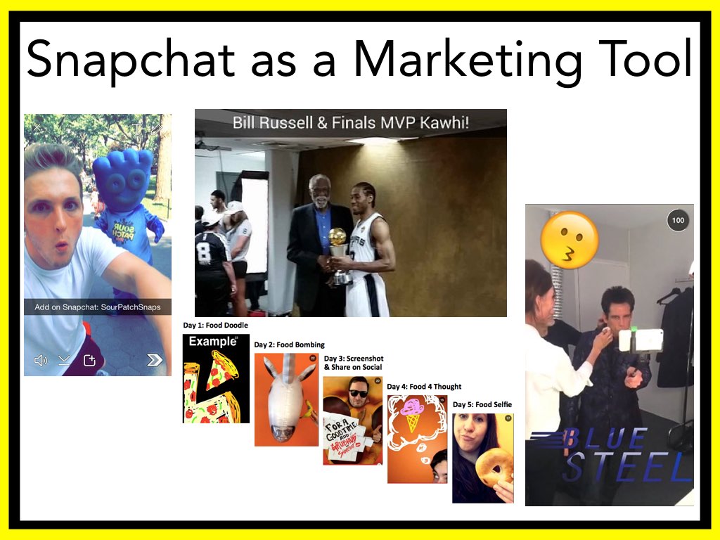
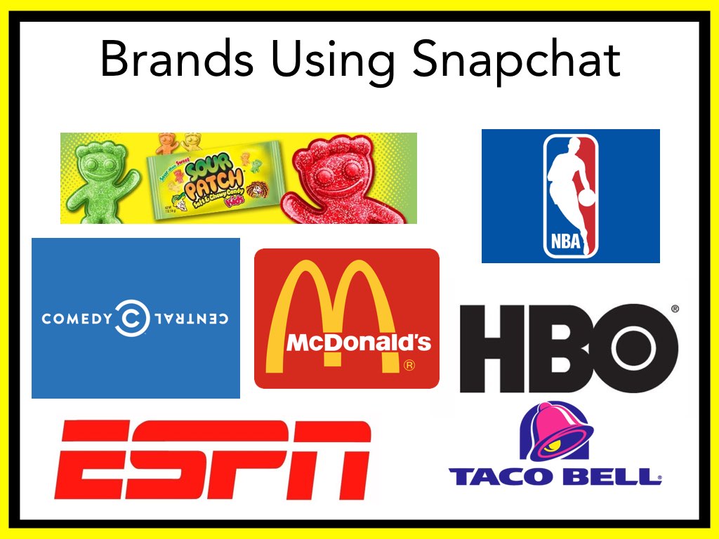
Check out this awesome presentation on Snapchat by Telly and Glenn. It's so great, you won't have to go anywhere else for your Snapchat tutuorials.


● The website should have good substance. This includes content, information architecture, a CMS, and infrastructure.
● The content in the site should be relevant. It should be of quality enough that it is relevant to the user. The performace of the site and its UX play heavily into this as well.
● Avoid purchased links and bad UX design. Search engines will discredit your site for this.
● Know your business model and design accordingly. Having a layout that encourages clicks improves your SEO as well as the potential for hooking new customers.
● Keywords should be consisent on the site as well as on social media sites. This is also important to stay consitent in keyword language when advertising as well so customers will be typing similar words as those in your keywords.
● Domain names should be consistent so people will be directed to your site. Also insure that domain names do not come with "baggage" from a previous owner.
● Optimize for different results across all types of devices and media.
● Focus on metadata and title tags. These may not be focused on by search engines much, but it is important to have them in order.
● Make sure your site is bot accessible and remove impediments that may make "crawling" your site difficult.
● Built to be shared. Make sure social media buttons are accessible and easy to use.
Pheww!!! That was a lot. Can you believe there is MORE. SEO is a complex full time job but definitely worth the work in the end.